|
I'm on the train at present. I bought a 3G dongle about 8 months ago and it is a great tool. I hate wasting time, and I hate traveling the same route day in day out. I like travel, but it needs to be interesting. The daily commute can be boring. Of course, I could drive the car , but is that the best use of time? On the train, you don't need to just stare out of the window. With a 3G internet access it's possible to clear all the email and social networking messages. You can make plans and get set up for the day, update your blog and do research. But the best use of time I saw recently was tweeted by @HR_Thompson_AZ "Check this video out -- Kathleen McElwaine: Watercolors http://youtube.be/ataLdnoDCZM. Check it out! 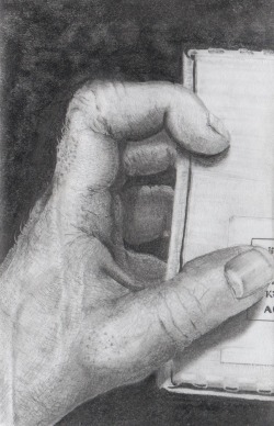 This is a drawing of my left hand. It's a small drawing - about 3/4 life size. Most of this, I did while on the train.
0 Comments
1.2.22 Contour Contour is an outline. Usually, there is contrast between a subject and the background. This contrast might be in colour, value or focus or texture. The contour of the object is a line which follows the boundary. You can make a contour drawing which will successfully represent an object even if the proportions are poor, and the shading and texture is absent. The illustration [fig:Contour-Drawing-of-hands] depicts just essential contours very simply using short, independent straight lines. Alternatively, you can try an exercise to draw a single smooth contour without either looking at the paper, or lifting the pencil. In this case, you stare at the subject, and concentrate only on the contour. Proportion and shape is not important to the exercise. See [sub:Contour-drawing-exercise.] for more information and an exercise. 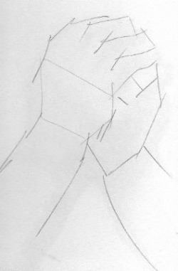 In this very rough contour drawing, the outline of the subject is all that is drawn. It is not even drawn particularly carefully or with any detail. The simple lines just indicate where the boundaries are.
When we draw a portrait, a preliminary contour drawing is useful. If our preliminary contour drawing is proportionally accurate then we may wish to extend the concept inside our object to identify abstract shapes within. This will aid us in the rendering stage. It's advisable to make the contour lines feint and use a soft pencil. Usually, the contour lines will be erased or covered over during rendering. This is a 'hit and run' post. I urge you to check out
Ennyman's Territory - not because he interviewed me, but more because it has such a lot of information relevant to artists, and this is melded with loads of interesting diversions. I think you could get 'lost' in Ennyman's Territory. That's all I have time for at this point - got to go. Have fun with 'Ed'! In the picture below - you will probably be fooled. It is designed to make you see comical faces looking at some kind of floating blob and weird tongue-like things but the real image is hidden in the negative space. See if you can find it. Click on the image for a large view. 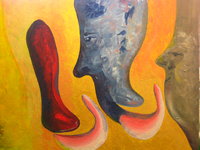 1.2.21 Negative space. Beginners often draw the shapes and objects which are the subject. This might be an apple, pear, banana and a bowl. If, however, you consider the arrangement of items, and instead, study and draw the shapes which make up the space between the objects, then you get a different understanding of what you are seeing. These negative spaces are part of the composition. Sometimes, a negative space is more important than the objects, and it will often contribute to the overall result of your drawing in an unconscious but significant way. When you draw negative space, you use the more 'arty' sections of your brain because these shapes are usually abstract. Since they are abstract, you can draw what you see, and not what your logical part of your brain tells you to see. If you are using a reference in the form of a photograph or a live set-up then it's very common to draw what you know and not what you see. Initially, this often leads to an average or poor result. The problem is how our brain works. We seem to symbolise many shapes, so that an eye has a standard simplified shape, and a mouth has a simplified shape. It is as though our brains store a set of approximations which we use for some kind of pattern-matching machine when observing the world. Perhaps for this reason, the non-artist looks at a person's face and spends sub-seconds on each feature while the seasoned artist will tend to focus on a particular area and study it deeply. As you do more drawing, you will find that your interest lies not so much in the shape of a mouth or nose, but in the way that the shadows fall over the contours of the face, and how the light picks out imperfections in the skin. Study of negative space aids this artistic way of viewing the world. In some complex scenes, where the foreground consists of many tiny shapes - like tree branches or hair, then it is often easier to identify and draw the negative space before filling in detail in the foreground. Manny - thank you very much for agreeing to this blog interview. I happened across your photographs while looking for portrait artists and was blown away by somethnig intangible but powerful in the pictures. Can you explain what causes you to raise the camera and go for a particular shot?  If a work of art does not move you; if it does not cause you to stop and think; if it does not make you look; if it does not increase the information in your own brain, then can we call it art? I think not. I think art necessarily has an element of 'surprisal'. That's a real word too. If I told you 1+1=2, you already know it. You could easily work it out. It's obvious. 1+1=2 does not surprise you. But if you threw a coin, and it came up edges, that's surprisal - and a lot of it - especially because you smugly predicted either heads or tails. The case of edges fills your mind with new information. Your brain cells 'light up'.
If art causes surprisal, then it's good art. If not, then it's boring. Robert Hughes takes an intelligent swipe at the modern commercialization of the art market today. Feel free to leave your opinions.
1.2.20 Light Obviously, without light, you can't see. It is only the reflection of light which reaches your eyes that causes your mind to see the object. But from an artistic sense, there is more to it than this simplistic statement of physics. When a painting has light, it glows and lives. 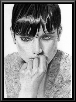 There must be millions of good drawings and paintings which don't make the best use of light, and therefore remain only good pieces of art rather than great pieces of art. In the illustration, each tiny bead on the blouse reflects light. There is a prominent shadow under the chin, and a strong highlight in the hair. Her knuckles reflect more light where they protrude.
Often, in western society and those that read left to right, the observer will tend to also 'read' a painting or drawing from left to right. For this reason, it is common to find the light coming from the top-left as it is in this illustration. However, such 'rules' should be flexible, and some dramatic effects can be had by using two or more sources of light, and lighting the subject from below or directly from one side. Whatever you choose to do, try to make the light work for you. If you don't want to buy and register your own domain name, there is a free service that lets you look like a purchased domain:
For example : http://www.spooks-art.tk/ This is available at: www.dot.tk The upside is obvious as it's free but we all know that free usually comes with a price. Here is the cost:
Recently, I came across an Australian Print on demand service called redbubble. At first, I thought it was a sight only for graphite drawings since that was the search term that I used to find the site. However, after foolishly under some confusion managed to send a support request to the site admins asking if I should join the site - I realised that it was a whole lot more than just graphite. It turned out that this is a print on demand service where members of the public can purchase artwork and have it delivered in various forms.
I joined the site, and found that the graphite artists were in only one of hundreds of specialist groups. So I also joined that using "spooks-art" as a handle. Being the conservative sort, I'm doing further due diligence to, looking for independent reviews and so far things look pretty good! The site was originally Australia only, but now it is international. I think I'll read up on it some more, and maybe start uploading some merchandise for sale. |
(C) Jeremy Lee 2010, all rights reserved.
Note: I am allowing the blogs in the category 'Book' to be stored for personal use only, but not for distribution or commercial use. Should you wish to reproduce any material, please contact me for negotiations. Categories
All
 spOOkspOOk's art is owned by Jeremy. He has practiced drawing and painting for about 40 years, and might get good at it one day. spOOk's art is focused on graphite portraits. Archives
October 2016
|
