|
1.2.36 Punching up
When you complete a drawing, all the general values have been established. The mid tones should be right and all the shadows in the right place. But sometimes you need more impact. A process called punching up can improve the drawing. This is where you look for the deep shadows and try to make them blacker. It increases drama and contrast. 1.2.37 Blending When you put graphite onto the paper, you often want a smooth transition from dark to light. In one technique which we shall look at, this is achieved without blending. The results are very nice, but the process is slow (circularism). Many people like to use a tool like a rag or tissue to move the graphite around on the paper to achieve a smooth result. Blending is to take a non-drawing instrument and use it to deliberately smudge the graphite. Depending on the paper and the grade of pencil, and the blending tool, different results are obtained. Here are some tools in common use: • Tissue. • Stump. • Paper. • Rag. • Paint brush. • Tortillon. • Chamois.
0 Comments
JL: Hello Charles! I found your incredible paintings onThe Figure in Light after following a retweet on Twitter and instantly saw a high skill level. You are a full time painter. Could you explain how this came to be?
CP: Hello Jeremy. Thank you for your interest in my work. Here I am talking to someone on the other side of the planet whom I have never met, all thanks to the internet. I have been painting full time for about ten years. This has been possible because I have a great gallery, The David Klein Gallery in Birmingham, MI. Just as importantly my wife, Lauri Palmer, has been incredibly tolerant and supportive. JL: What is your favorite medium? CP: I work mostly in oil. JL: Why do you like working in that medium? CP: It is forgiving, it has gravitas, and I like greasy things. JL: What events outside of pursuing art have caused you most grief and joy in your life? CP: By far the most joy has been my family. We have a son who just graduated from college, and a daughter about to enter high school. The greatest grief has been the financial struggle to keep it all going. JL: Unfortunately, the cost of modern living is a major problem. It is clear to me especially for non-representational contemporary/modern art and ephemeral art that the technical aspects of a work seem to be secondary to the story of the artist behind the work as part of an unpalatable marketing machine energized by greed. I know this is a bold statement - but what are your thoughts on this? CP: I would agree in part. There certainly is a mercantile aspect to the art world that can be distasteful, but I suspect that has always been true. Regarding skill, or what you refer to as technical aspects, I think there are many non-traditional artists with loads of that, and I respect them and in many cases enjoy their work. Yet I think that modernism as a whole is disconnected from our larger culture. Very few people relate to modern art, regardless of how good it might be by its own hermetic standards. The problem though is not with the art world. In my view our culture itself is in decline, and the art world, as well as so many of our other cultural and civic institutions, has come undone. JL: I think that is a very thoughtful ans skilled answer. Please tell me more about your Pollack-Krasner Award, what it means and its origin. CP: It’s a foundation established from the estate of Jackson Pollack and Lee Krasner that gives financial support to artists. They award quite a bit of money. I got my award about ten years ago at a critical time and it really helped to keep things going. That’s one reason I can’t be too hard on modern art! JL: I do in fact enjoy Jackson Pollack's work. What events lead up to this honor? CP: I simply applied for it. I encourage anyone who is interested to do the same. It has nothing to do with who you know or anything like that. Just do an internet search and apply, but you might have to keep applying before you get an award. I applied two or three times before I got mine. I apply for lots of things, but most of them I don’t get. I still have the Guggenheim in my sights. JL: I can see that you take a great deal of care to depict light in your subjects. Could you please describe what goes through your mind as you paint in this regard? CP: I think the real medium for all visual artists is space. Light reveals form in space. Light, form, and space are fundamental to visual expression. I suppose I take this for granted and don’t think about it much when I work. I’m mostly trying to make something that looks good. JL: Is this why you called your web site "The Figure in Light"? CP: I guess so. I was just trying to think of something catchy. JL: The name works. It's easy to remember and speaks something about art in general and what you do. Looking back over your formal education, what do you consider most helpful to your current professional career as an artist? CP: The MFA program at the University of Iowa was very important. It attracted ambitious students from all over the country, and it had a lively visiting artist program. While there I was awarded a scholarship to the Skowhegan Summer School of Painting and Sculpture, and that was a critical experience for me. Being from Michigan, and having just gotten married, it was a big decision to move to Iowa, but I am really glad I did. I also want to mention Robert Wilbert, a painting professor at Wayne State University in Detroit. I took a couple of classes from him before going to grad school in Iowa. He was incredibly influential. He taught me to see space. JL: Are there things which simply cannot be taught? If so, how do you acquire those skills? CP: This is a really important question but I’m afraid I just don’t know. Sorry. JL: That answer is oddly satisfactory, and I am sure there are people who hold an opinion, but who is to say they could possibly be correct? As a teacher, what advice can you offer for young or beginning artists? CP: You have to be obsessive about working. You must get into the habit of drawing daily, and always keep a sketchbook, like a diary. Draw anything and everything – the view out the window, your friends, yourself, your toes, what you dream and daydream about – but mostly draw from life. Avoid working from photographs for at least ten years. JL: Charles, It's been a pleasure. Thank you very much for your valuable time and insight. CP: It’s been a pleasure for me as well Jeremy. Thank you. 0 0 0 0 0 0 0 If you have more questions. I am quite sure Charles would be able to respond. It's cool and wet and windy in Sydney town today The bins are crammed with brollies in temper thrown away. Broken, busted useless ravaged by that wind. An image on display of sapien temperamind. I saw a documentary about gorillas under trees who when it rained just soaked it up not shooing it away. What's happened to this human race? Impossible to say of why or how or who or what would wish the rain away.
1.2.34 Pop
When you draw something that should be sticking out of the page, like a nose, if it looks like the paper is no longer flat, and the nose could really be sticking out of the paper, then it has POP. This is achieved by careful rendering of light and shadow. 1.2.35 3D A piece of paper only has horizontal and vertical coordinates. It therefore only has two dimensions, but we can use shading, highlights, focus and blur to create the illusion of a third dimension perpendicular to the page. This really is an illusion. The paper is flat, but the mind is accustomed to seeing certain shadows and highlights in certain arrangements on a real three dimensional surface. When we successfully emulate this in a drawing, the effect is to trick the mind into appreciating this third dimension. Part of this is simply because the sun is above, and shadows are underneath objects. This fascinates me. iConji is a nacient pictorial language inspired by the way that TXTing is essentially becoming symbolic LOL , ROTFLMAO CU L8R. It looks like a modern rebirth of Egyptian hieroglyphs. If you know about computer science, then you might also note that it is sort of like a P-code. In computer science, a P-code is an intermediate language that is not native to a particular architecture, nor is it something that you would choose to use as a programming language. Instead, P-code is easy to read for any particular kind of computer, and easy to produce from any particular high-level language. It provides an intermediate stage that has only a small performance-hit but with the advantage of architecture independance.
iConji fulfills a similar function. Many spoken languages could be usefully represented by select symbols, and these symbols can be usefully translated into another language. Hence you instantly have the ability to create an internationally neutral string of symbols. Pictograms are not new of course. Obviously there are several methods of writing which use little symbols to represent objects, ideas and so on. What IS new, is that the iConji is served up for use by computer assisted end-points. At present, the iPhone, and a web application, and a Facebook app, perhaps more, and soon, perhaps many more when and if an application builder is released. You might be wondering why I am writing this on a site dedicated to art... well, it's because they have a call for artists. See HERE. But that's not the entire reason that I've got energised about this. The other reason is not about the symbol, but about the metadata that it carries. Once a symbol is "born", it carries with it the original artist's name, and even a little story about how it came about. This is new. It's really new, and you have a chance to get in early before the next 50,000 symbols are created. At present there are less than 2000 symbols. If you create a symbol, then you will have the ability to track it throughout its use in the world. I find this amazing, and the possibilities for use (and misuse) over time are staggering. Here are the commercial terms. I am not going to tell you what to download or how to use it etc, as this is easily discovered on the official site. They also have a twitter feed. (@iconji). The one question that will obviously be asked is, "How do I cope with 50,000 or even 2,000 unique symbols?" The answer is of course that the end-points are 'computers' so each will have the ability to allow you to look up a symbol using your native language when creating and reading it. If you like this, please comment. If you don't like it, please let me know what spOOks you, and if you get a symbol made and accepted, then I'd love to know. JL: Matt, we met on artpapa and deviant art, then facebook, and now twitter! I guess the graphite-artists seek each other out. I've seen your awesome drawings and peoples' favorable reactions. What do you see for the future of this medium in the art world?
MD: I'm not sure what the future holds for this medium in the art world but in my opinion, and from what I've seen, pencil /graphite drawing is becoming increasingly popular and more appreciated. I do feel it's been under appreciated in the past though, particularly when it's put side by side with other mediums. It seems quite common for oil and acrylic paintings to do well in juried competitions but pencil work rarely seems to get the same praise. I'd love for pencil work to be on a more level playing field as oils, acrylics and other popular art mediums. I know it's all down to personal taste and preference but I think maybe the average person/non artist appreciates or understands how much work goes into some drawings. I think as soon as you mention 'pencil', people assume it's going to be just some quick sketch and that often they don't realise that these days highly realistic drawings are being produced by some damn fine artists and with damn fine results. Take people like Armin Mersmann and Paul Lung (to name just 2 from so many thousands of talented pencil artists), and see just how detailed their drawings are. JL: How log have you been drawing, and why did you start? MD: Well I've been drawing since I was about 7 years old (I'm 35 now) and have always had a good eye for perspective, form and light and shade so I'm lucky in that sense. I was always told that my drawings were very good and I always thought they were too.............until a couple of years ago when I discovered Deviantart and saw for myself the truly amazing drawings that were being produced by people with a simple pencil. It was at that point that I took a long hard look at my drawings from my past and thought "okay, they're not bad but they are far from good or great". I decided then to reteach myself 'how' to draw using tips and techniques that I read about from other pencil artists on DA. The advice and help that I was given was invaluable and helped set me on a new road with regards to my drawings. As mentioned earlier, I was already blessed with some form of artistic talent but I desperately needed to hone those skills if I ever wanted to accomplish my dream of having my art on show and someday for sale. Also, several years ago I went through quite a bad time in my life that completely demotivated me and thus I lost the will to draw. After seeking help for my 'problem' and finally getting the help, I was put in touch with an art tutor who took a small group of people in a similar position as myself, for just 2 hours a week, and helped to inspire and motivate us again. It worked for me and that's when I discovered DA. So to sum up, although I've drawn for as long as I can remember, I only consider the last 1 - 2 years as being professional with regards to how I go about producing my drawings now. I've learnt more in the last 2 years compared to the previous 27 years and it's changed my drawing life. JL: Are you from an arty family? MD: No, not really. My father was a good technical drawer and certainly had an eye for perspective and form, much like I did when I was a kid so maybe I picked that side of things up from him. My daughter (who's 4 years old) also has a keen eye for things and she loves to draw whereas my son (her twin brother) isn't so adept. JL: Who do you turn to for inspiration and why? MD: I generally turn to other pencil artists for inspiration. Just looking at other peoples drawings is enough to inspire me although picking a suitable subject matter has always been an issue for me. In the last year I've discovered some really great art forums such as Artpapa and Wetcanvas and these forums have really helped to inspire me. The artists there, no matter what mediums they work in, are so helpful and offer such great advice and constructive criticism and I'm eternally greatful for these forums. JL: I see you would like to go mainstream. What steps are you taking to make this happen? MD: Well at the moment I'm concentrating on building up my portfolio as I only really have 4 drawings that I consider as 'worthy' of being shown. I tend to post my WIP's (works in progress) on various art forums that I've already mentioned so that I can get constructive feedback and advice from other artists. Generally speaking it's through word of mouth, forums and sites such as DA that are helping my work get noticed. Also Facebook, and more recently, Twitter have proved to be a good way of getting my stuff out there. As yet I've not approached any galleries or exhibitions but I will do that once I have a bigger portfolio. Also, people such as yourself, Jeremy, have been so helpful and even this opportunity of doing this little interview is invaluable to me. Once again, thank you for this and hopefully someday I can repay your kindness. JL: Are you going to specialise exclusively in graphite or do you have other plans and interests? MD: As it stands I work exclusively in Graphite but I have worked with Acrylics and pastels before. I don't really get on with pastels but I loved using Acrylics and hope to do some more Acrylic work in the future. I also feel that expanding on what mediums I use will give me better opportunities and make me more versatile as an artist. At the moment I intend to keep concentrating on my Graphite work in order to build up my portfolio and once that's done then I'll put a bit more focus on Acrylics. JL: You put many hours into a given work. Do you see this as a problem from a commercial point of view? I mean, how do you make a trade off between commercial productivity and just letting it flow at a natural rate? MD: Indeed I do put many hours into my drawings. Infact, my last drawing took close to 150 hours to complete. I'm not the quickest drawer in the world anyway but I'm such a perfectionist that this adds to the time that a drawing takes to complete. Everytime I start a new drawing I think to myself that I won't allow myself to get too intricate but I never manage to do that. I generally need to learn to improve on the time that my drawings take but without compromising the quality of my work. I think I will be able to speed up but it's all a learning process and will take me time to get comfortable with working faster. Also, taking so much time on a drawing isn't practical from a commercial point of view as 'time = money'. If I can produce more drawings over a shorter period of time then I will have the opportunity to make more money as it just doesn't make good business sense to put so much time into something that people wouldn't be willing to pay for if I had to charge an hourly rate (not that I'm sure how to price myself anyway) but like I said, I'm still learning and as it stands I don't currently make money from my drawings anyway. JL: Have you been approached by any interesting sources for commission work and so on? MD: In short, no. Many people have looked at my drawings and are pretty gobsmacked when they realise that something's a drawing and not a photo as they initially thought but no, nobody (other than one person) has requested any commissions from me. Hopefully someday they will but to be honest I don't really advertise or say that I'm available for commissions. I also figure that people currently have less money to spend on non-essentials such as a drawing due to recessions etc,. I'm also wary of doing commissions as I worry that I may not enjoy drawing them as much. I noticed whilst drawing my only commission that I just wasn't bonding with the drawing because it was a picture chosen by the client. I had no real creative leeway like I would have if I was drawing from my own reference or from my own ideas and imagination. I guess it has to be a compromise sometimes and that I'll have to give up being creative on the occasions that a commission may come my way. JL: Thank you so much for your time. Is there any advice that you could offer to other graphite specialists out there? MD: I don't really have any advice with regards to marketing or selling work as I'm only learning that now myself but in terms of advice to do with techniques, then yes, I can make suggestions based on what works for me. Firstly, these are things that work for me and may not work for others. I never/rarely blend my drawings although I did once. I've found that using the 'circulism' technique is my preferred method of drawing, although this technique takes quite long, hence why some drawings take me 100+ hours. By using this technique I'm able to get a smooth look but not an unnaturally smooth look. It's perfect for drawing skin as it gives the impression of tiny pores. If I do ever blend then it's usually only very tiny areas and I use a tortillion, very lightly, for this. When using the tortillon I also use the circulism [a.k.a. circularism] technique as it gives a more natural looking smoothness in my opinion. JL: I think the blending advice is sound. You pointed to a tutorial at Duey's Drawings. And I've got one in this blog too. Well good luck with your career! -Jeremy 1.2.33 Depth
This is a term which can be used to describe several things about a drawing. Good contrast might give depth, but so might the subject matter in an emotional sense. Control of focus and all the other elements might contribute to depth. It might be easier to describe this by imagining a person who is shallow, and then one who has great depth. It's hard to put these concepts into words, but if you can imagine the person who has depth, and then apply the feeling to a drawing, then this is what we are trying to understand. Depth can also be part of the history of the drawing, and of the conditions and life of the artist. It is for this reason that some reasonably ordinary works get sold for a lot of money: the artwork is inextricably linked to a time, place, world-view, political environment and the trials and tribulations of the artist. Do not overlook this important and intangible concept. 1.2.31 Angle
Lines which are drawn or implied which are not either horizontal or vertical create a dramatic effect. Diagonal and angled lines help to accentuate a subject or lead the eye to a specific place in the drawing. Sometimes, the diagonal lines are made from parts of the subject. Sometimes the lines will be part of the background. As with any tool, don't over use the idea. Ideas that are over used become boring. 1.2.32 Composition You will be able to obtain a whole book dedicated to the topic of composition, so I'll mention that it is very important, and advise that you find some extra literature on the subject. The purpose now is to define the term. Composition obviously comes from the verb to compose which means to put parts together into a new whole. In a picture, the parts that are available include at least the following:
A good composition will hold the viewer's attention, and let the eye explore the drawing and rest on the desired subject matter. All the elements should compliment and enhance the subject, and there should not be two or more equally competing objects in the drawing... unless of course you want and can control this effect. It is also a good idea to arrange the objects so the viewer's eye is held within the frame. A drawing which contains an arrangement that causes the eye to leave the frame is unlikely to hold interest. Some, or perhaps most people can feel a good composition when they see it even without being able to explain the theory behind it. If you can do this, then take advantage of it by playing with the elements until they feel right. This is a good reason to draw several sketches. I've written a tutorial on how to draw skin texture without blending. It describes circularism - at least one way to use it to simulate the pits, marks, pores, creases and little features that help to promote realism. Click HERE. 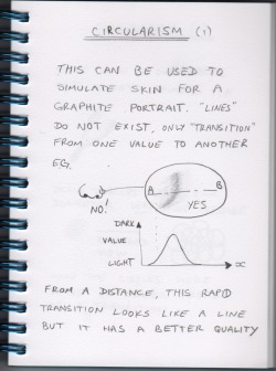 1.2.30 Feeling
It might seem strange to talk about feeling in connection with drawing, but one of the goals of art is to induce some kind of emotion in the viewer. You can use expression on a person's face to convey a feeling. This might be sadness, shock, tiredness and so on. Also, the background, texture, composition and the way that objects are presented will have an influence on the feeling of a picture. Colour invokes emotion but in our graphite portraits, we have only shades of grey. Although this might seem a disadvantage, it can be very dramatic and deep. It is interesting that black and white photography used to be the cheap and easy method, while colour photography was considered expensive and elite. But today, we find that the processes for colour photography has become mass produced, cheap and common. Black and white photography is now considered dramatic, arty and elite. At the time of writing (2008), graphite art is slowly making progress in the art world. Hopefully, this is because great graphite works are so capable of showing feeling. The absence of colour should be treated as an advantage to bring out the drama of a subject. |
(C) Jeremy Lee 2010, all rights reserved.
Note: I am allowing the blogs in the category 'Book' to be stored for personal use only, but not for distribution or commercial use. Should you wish to reproduce any material, please contact me for negotiations. Categories
All
 spOOkspOOk's art is owned by Jeremy. He has practiced drawing and painting for about 40 years, and might get good at it one day. spOOk's art is focused on graphite portraits. Archives
October 2016
|
