|
1.3.3.1 Wooden pencils
There is definitely a wide range of quality available for wooden pencils. The main difference is consistency. You need the graphite core to be devoid of hard scratchy bits, and places where it breaks easily. Obviously hard pencils don't break very easily, but they may contain scratchy bits. These scratchy bits can damage the paper. Soft pencils can be easily broken, so as well as careful sharpening, you need good quality construction because if the lead is fragile, then it becomes very difficult to sharpen. The wooden casing also needs to be soft yet consistent. It should be easy to remove with a knife without putting undue strain on the lead. You will need to purchase various brands to find out their characteristics, or get some recommendations from someone who has already gained the experience. When you sharpen a wooden pencil, it is useful to shave off quite a lot of wood to expose a very long core. Use a knife rather than a pencil sharpener because you have a lot more control, and a sharpener is very wasteful. The point that a sharpener creates wears quickly, and you need to frequently sharpen it.
3 Comments
Here we discuss more paper types:
1.3.2.4 Mat board Mat board is readily available because it is used for mounts around a picture in a frame. It is acid-free. Mat board usually has significant texture. It's fairly difficult to work on for beginners and it might be a little delecate compared to high quality paper. This means that it will not “take the layers” as well. However, some artists like mat board for graphite. If you use it then be very gentle with the pencils. Use only the weight of the pencil to make a mark, and be patient. 1.3.2.5 Illustration board Illustration board is finished only on one side. This side is often watermarked in one corner and can serve as an indicator if you are in doubt: The watermark is visible from the good side. If you cut down a full sheet, then place a small identifier on the good side to make it easy to identify. The surface of an illustration board is very good for scanning and as a master for print making. If you intend to easily reproduce your originals to sell copies, then consider illustration board if it suits your style. 1.3.2.6 Bristol board Bristol has two working surfaces. It is often lighter than illustration board. It is good for long-term use and preserves well. You can also find archival Bristol board. 1.3.2.7 Plate Plate Bristol board is somewhat like hot press. 1.3.2.8 Vellum Vellum Bristol board is somewhat like cold press. 1.3.2.9 Drafting paper Drafting paper is an interesting medium. It is smooth, yet rough which is an odd thing to state, but I mean by this that it seems smooth to touch, but when you draw on it, it grabs the graphite and wears the pencil quickly. It's almost like extremely file sand-paper. Because of this, it produces a very good black. Another interesting property is that it is translucent. For beginners, this is an advantage if you care to copy a picture on a scale of 1:1. Simply overlay the drawing, and trace a contour. Then you can place the drafting paper on a clear white background and progress to rendering. When you use an erase, it will smudge. It will also smudge when touching it, however these smudges will vanish with a clean eraser, and the surface is very tough. It's an unusual but interesting option for graphite artists. Let's look at some paper types:
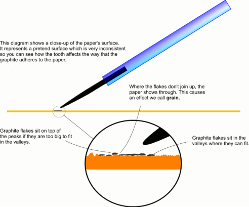
1.3.2.2 Hot press Hot press paper is formed by squeezing the paper through hot rollers. This makes a smooth surface. Since it has little tooth, this means it is less abrasive which often means more difficulty to get very dark non-shiny shadows. Its smooth surface is good for very fine detail. When you need to create a texture-effect, then you need to build the texture with layers using differing techniques and pencil grades. Hot press can often be more expensive than cold press paper for a given weight and size. The smooth surface is good for making copies and preserving fine detail. Hot press board often comes in bright-white or with a coated surface. The advantage of bright white paper is greater dynamic range. However, a smooth or smooth and coated surface might be difficult to apply heavy dark areas. As usual, once you find a supplier, it is a good idea to test the paper with a quick sketch. If you like the bright white and the coated surface but have difficulty getting a deep dark, then consider using a carbon pencil. See [sub:Carbon-is-a]. A very bright white paper might be difficult to reproduce onto normal paper, so the original is likely to look much better than copies. The bright white paper can also cause significant problems to get even illumination for photographic reproduction and display/viewing. 1.3.2.3 Cold press Cold press paper may also be called “Not Hot” or simply, “Not”. It has more tooth than hot press paper which makes fine detail more difficult, but is a better surface for deep darks with no shine. When you need to create a texture-effect, then the tooth of the paper can be exploited by choosing various pencil grades and pressure.om the top bar. 1.3.2 Paper Paper comes in a bewildering range. Quality and characteristics vary with price. You must purchase acid-free paper. This is because normal paper as you might use in a printer reacts with light. The manufacturing process is tuned for profit and to produce a product fit for the purpose and copy-paper does not need to have archival properties. Neutralising acid during the manufacturing process is an extra expense. As a result, normal paper has a small amount of acid in it which reacts over time with the environment and turns yellow. Artists' paper is nearly acid-free and this is a big advantage for long term exhibition. Not only must your paper be acid free, but so too the mat board used to frame your work. Paper comes in different shades. Most white paper is only white to your eye in isolation to a comparison. You will find that there are many shades, some 'whiter' than others. Some are beige, some slightly yellow and so on. Paper also comes in different smoothness. Very smooth paper is good for high detail, while you may prefer a rougher tooth for a different look. You can burnish parts of the paper to simulate a smooth paper. Sometimes the paper is smooth on one side, and rough on the other. In that case, it's best to mark the paper with a small cross in the top right corner on the side that you choose to use. Especially if you are doing a series, or a triptic, it's important to be consistent. Paper comes in different thicknesses also called weight. See weight [sub:Weight - paper] Obviously, the higher the weight, the thicker, and more robust is the paper. Very thin paper might be smooth, but easily creased. Another overlooked characteristic of paper is how easily it allows an eraser to work. Different paper reacts differently to moisture. Some will crinckle and stain, while specialist water-colour papers are more stable. Finally, different surfaces take pencil differently so that the blackest black you can get on one paper might be considerably darker than on another. The diagram below details the microscopically rough surface of paper, the size of graphite deposits, and why the paper still shines through even when covered in a layer of graphite. For these reasons, there is a need for experimentation. Only your own preference and experience can help you ultimately to choose the right paper for a given style and subject. If paper was perfectly smooth, you would not be able to make a mark on it with graphite because it would not be abrasive enough to tear away graphite from the pencil. Each paper type has its own roughness. We call this tooth. Since the size of flakes of graphite varies with different grades of pencil, the combination of pencil-choice and tooth is significant. Soft graphite has quite big flakes, and will therefore sit on top of the paper's tooth, not in the valleys. You can use a harder pencil over the top of a soft layer to try and force the soft graphite into the valleys. A hard pencil will be able to fill the valleys, but will not be particularly dark of course. You can get different effects by choosing the order of layering. Here is the reasoning: Soft big graphite flakes are slippy (and shiny) but soft. So a hard pencil on a soft layer will break up the flakes, force them into the valleys, and the peaks will shave off the harder graphite. Hard over soft works well. In the opposite, if you lay down a hard layer, then because it fills the valleys and covers the peaks, and is still slippy, a soft grade is less likely to go on top. Contrary to some of my readings where it is said that you should only apply hard over soft, I think each is a legitimate technique. If you lay down soft lightly first, then some paper will still show through, leaving a grainy appearance. The harder pencil on top will therefore enhance the grainy appearance because it will adhere less to the flakes of graphite that are already there, and stick well to the exposed parts of the tooth. You should try this and note the result. Compare this with putting down a light but complete layer of hard pencil, and then applying soft over the top. In this case, you don't get the grainy appearance, and instead get a nice smooth result. This technique will not get it as dark. When you make a transition from very dark to light, and would like to do so with a smooth result, the very dark areas need to be done with soft:layer-blend-layer-blend-layer while the lighter areas with hard then soft. Blending is optional depending on the look that you want. In the transition area where it is not the darkest, and not into the 'hard then soft' area, you need to mix the technique. Any experiment you do using a given set of pencils will have a different effect on different paper. Each paper has a tooth-size, and there will be some grade of pencil which just nicely fills the valleys of the tooth. It's useful for any given type of paper to find out what grade of pencil does this because a flake-size which just fills the tooth is like a benchmark for that paper. It will give you an easy convincing dark without too much shine, and if used lightly, is less likely to give a grainy effect. Use a very soft pencil for a deliberate grainy effect, and a hard one to prepare the paper for a controlled layering of softer pencil on top. 1.3.2.1 Consistency Like many other products, paper is manufactured. It is made from wood pulp, and other additives. The quality of the pulp, and the quality of the tools and processes and cleanliness of the environment is important. Cheap paper will be made in an inferior way, often with hard bits, contaminants, and sometimes holes. These inconsistencies might not show up until you try to put a layer of graphite on it. More expensive paper is worth the price because the chance of getting a poor spot is reduced. It is still possible to get bad paper that is sold as good quality, but the event is rare. I've read anecdotal reports which claim that paper sold in a block-pad is more consistent than loose sheets. Why this should be so is a mystery to me, but worth mentioning as the information has come from several sources. If you burnish paper, it will take the pencil marks differently to untouched paper. However, you should be in the position to choose when to do this. Don't do it accidentally, and avoid poor quality paper which might have burnished spots. See also [sub:Oils-(In-skin)]. 1.3 Tools
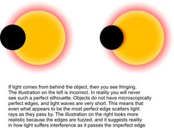
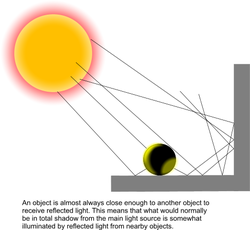
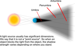
1.3.1 Smudge mask On a large work, you might need to rest your hand on the paper while drawing. A smudge mask helps to reduce or prevent smudging from your arm. It's nothing special. A normal piece of paper works well, but grease proof paper or baking paper as used in cooking works better because it is slightly slippy and less likely to raise graphite from your drawing. It's quite easy to rip, so you can tape some baking paper over your work, cut a hole in the middle, and then progressively rip it away as you need to expose more of your drawing. It's also slightly transparent which is useful because you can see some preparatory marks below. 1.2.42 Glaze A rounded and smooth point on a hard pencil produces a light but consistent mark on the paper. If you use this over the top of other layers of graphite, and make it cover the whole area consistently, then we call it a glaze. It has the effect of filling in little gaps and inconsistencies. It is this which often elevates a good drawing into something which becomes very curious to look at because it no longer looks like raw pencil marks. It fills all the tooth on the paper, leaving no stark white dots. It is often this step which makes a good pencil portrait look to some people like a photograph. 1.2.43 Oils (In skin) Try to avoid touching the paper at any time. Some techniques will cause finger prints and oily smudges to give an inconsistent result. Some areas of your drawing will suffer if you don't have perfect control over the values. For example, a smooth cheek won't look good if an oily finger print causes the graphite to be darker in one area. Other areas are not so sensitive - like the foliage of a tree, or an area in the hair. Graphite dust acts like a finger-print detector as the fine particles stick to the oils. 1.2.44 Embossing Embossing is a very interesting and sometimes extremely useful technique for preserving fine highlights. A good example is dark hair where there are numerous small hairs which reflect light. An embossing tool could be a knitting-needle type metal point. You need it fine but smooth. The idea is to compress the tooth of the paper so that subsequent layers won't fill the compressed area. It shines through to produce convincing highlights. You can apply this technique before any graphite is laid down, or after one or more layers. Applying the technique after multiple layers will give you half-tone highlights. 1.2.45 Burnish Burnishing is to rub a surface with a hard smooth object - like the back of a spoon. It will not scratch the surface, but it will change it. To experiment with burnishing, take a sample of paper, and a teaspoon. Burnish an area, then apply different strokes and grades of pencil to the burnished, and non-burnished areas. Try to get a feel for how this affects the area. Recall this in future in case it produces an effect or texture that you find difficult to obtain otherwise. It could work well with techniques involving graphite dust. 1.2.41 Sfumato - or transition In oil painting, sfumato is achieved using a dry brush. In pencil drawing, we try to emulate the effect. In the quest for realism, sfumato is a powerful tool. Its roots are in classical painting. Leonardo Da-vince used the technique extensively. In fact the famous enigmatic smile of the Mona Lisa is thought to be due to sfumato at the corner of her mouth. This area of shading seems neither to be a shadow or an edge, but something in between. The viewer is tantalizingly held on a precipice between drawing one of two conclusions. “It is a smile.” or “It is a shadow.” See also the description for scumbling as this is closely related. The corner of a person's mouth is an interesting area for a portrait artist. The slightest variation is detected by the viewer, and can have a profound effect on the person's expression. Additionally, the corner of the mouth is not so much where the lips end, but where they fade into cheek. This fade is complicated by the flexibility of tiny muscles in that area. Depending on how these muscles pull, the transition from dark to light in this area will vary. If you draw an outline for the lips, then in some cases, it sort of works for the upper and lower “edge” but joining those two edges at the corner of the mouth looks awful. This is where sfumato comes in. You need to suggest the edge but not draw it. You need to gradually but convincingly move from a dark tone to a lighter tone, and make due consideration for a dimple or slight asymmetry from one side of the mouth to the other. These tiny variations are extremely important for properly rendering a convincing realistic portrait. Above, I mentioned that an outline for the upper and lower lips “sort of works”. By that, I meant that you can sometimes get away with it not being too bothersome. If, however, you also use sfumato for the edge of the lips, the result will be more realistic. Lipstick will tend to complicate the position of sfumato, being that it may create a false 'edge' and possibly also allow the real 'edge' to be still mildly visible. Lipstick will look more like an edge and needs a quicker transition. Natural lips have a very much more subtle and wider transition. At no time on a person's face will you find a hard, definite edge. This is especially true for wrinkles and the boundary between the face and the background. Even if something is drawn onto the face - like a clown's makeup, then the natural texture of the skin will smear the edge. Creases in clothes, and on the neck benefit from sfumato. Ignoring this can lead to an unconvincing portrait. As always, with skill, these guidelines could be ignored but the result would a very different type of art. 1.2.40 Fringing and shadows If you hold an object against a light source, then you will find that its perimeter does not look like a solid and abrupt transition from light to shadow. Light leaks around the edge because the edge is not perfect. I call this fringing. Consequently, the shadow that is cast by the object does not have a perfectly hard edge. Therefore, you should not draw hard edges in shadows - partly for this reason, and mainly because of reflected incident light Additionally, light sources are not infinitely tiny. They have significant dimension which means that a light source sends rays of light past the object from a range of angles. This means that the intensity of shadow is greatest where the most light rays are blocked, and becomes weaker as you move away from that spot.
1.2.39 Layers
In the same way that you use multiple layers of paint to protect a door or produce an oil painting, multiple layers of graphite will improve your drawing. You might put one layer down as dots or circles in HB, followed by a glaze of 6H, then some dots or strokes with B, then strokes with H followed by some lifting and more layers. The result will be much more interesting than a single layer of graphite. These techniques are presented in detail in this book. 1.2.38 Lifting Once you lay graphite on paper, you might want to remove it. If so, then an eraser used in the conventional way will work fine. However, sometimes you don't want to remove it completely. Lifting graphite rather than rubbing it away will take off the top layer or so leaving a more even and subdued result. You might then add another layer or continue to lift graphite until it looks right. You can also lift parts of a shape to mimic how values reduce as the lighting reflects across the surface. Use a kneedable eraser to do this. |
(C) Jeremy Lee 2010, all rights reserved.
Note: I am allowing the blogs in the category 'Book' to be stored for personal use only, but not for distribution or commercial use. Should you wish to reproduce any material, please contact me for negotiations. Categories
All
spOOkspOOk's art is owned by Jeremy. He has practiced drawing and painting for about 40 years, and might get good at it one day. spOOk's art is focused on graphite portraits. Archives
October 2016
|


