|
I think the world has gone mad. There is a local mag' that's handed out daily to commuters on the train. An article in today's edition explaining how a German school teacher is suing one of the students for drawing a rabbit on the blackboard.
It's absurd! Without reading on, one could be excused for never forming a valid theory that would explain such a bizarre act. But it turns out, this teacher is deathly scared of rabbits. Upon seeing the image, she burst into tears and fled the classroom. The evil bunny-drawer claims she didn't draw the image, she only told other pupils about the teacher's irrational response to rabbits. I can scarcely believe this stupidity on several counts. Firstly, it's irresponsible for the teacher to simply assume someone is guilty without seeking some simple facts. Secondly, these are kids, and kids are playful. Someone in a teaching position needs to be fully capable of coping with acts far more difficult than an image of a bunny rabbit on a blackboard. Third, this is the teacher's problem. It's an irrational response to a non-threatening commonly encountered every-day image, and she should get psychiatric help. It's stupid, wrong and absurd to sue a child for her ridiculous problem. I am not however trying to diminish the impact to a phobia sufferer, but to encourage it to be recognised as an internal problem and deal with it appropriately. We as a society have rapidly become a group who like to blame other people even when it's nobody's fault. Unfortunately this is not the first instance of stupid legal action, nor will it be the last. But, until further notice, all my arty friends will have to refrain from drawing bunny rabbits for fear of legal reprisal; and where will this end? Bambi? Cotton-wool balls? Large open spaces (no more rolling landscapes for you!).
0 Comments
1.2.32 Composition
You will be able to obtain a whole book dedicated to the topic of composition, so I'll mention that it is very important, and advise that you find some extra literature on the subject. The purpose now is to define the term. Composition obviously comes from the verb to compose which means to put parts together into a new whole. In a picture, the parts that are available include at least the following:
A good composition will hold the viewer's attention, and let the eye explore the drawing and rest on the desired subject matter. All the elements should compliment and enhance the subject, and there should not be two or more equally competing objects in the drawing... unless of course you want and can control this effect. It is also a good idea to arrange the objects so the viewer's eye is held within the frame. A drawing which contains an arrangement that causes the eye to leave the frame is unlikely to hold interest. Some, or perhaps most people can feel a good composition when they see it even without being able to explain the theory behind it. If you can do this, then take advantage of it by playing with the elements until they feel right. This is a good reason to draw several sketches. 1.2.31 Angle
Lines which are drawn or implied which are not either horizontal or vertical create a dramatic effect. Diagonal and angled lines help to accentuate a subject or lead the eye to a specific place in the drawing. Sometimes, the diagonal lines are made from parts of the subject. Sometimes the lines will be part of the background. As with any tool, don't over use the idea. Ideas that are over used become boring. 1.2.30 Feeling
It might seem strange to talk about feeling in connection with drawing, but one of the goals of art is to induce some kind of emotion in the viewer. You can use expression on a person's face to convey a feeling. This might be sadness, shock, tiredness and so on. Also, the background, texture, composition and the way that objects are presented will have an influence on the feeling of a picture. Colour invokes emotion but in our graphite portraits, we have only shades of grey. Although this might seem a disadvantage, it can by very dramatic and deep. It is interesting that black and white photography used to be the cheap and easy method, while colour photography was considered expensive and elite. But today, we find that the processes for colour photography has become mass produced, cheap and common. Black and white photography is now considered dramatic, arty and elite. At the time of writing (2008), graphite art is slowly making progress in the art world. Hopefully, this is because great graphite works are so capable of showing feeling. The absence of colour should be treated as an advantage to bring out the drama of a subject. 1.2.29 Grade
Pencils are marked with a grading system. There are two measures: B and H. Each letter could be preceded by a number which indicates a weighting for the letter. B represents the amount of graphite and H represents the amount of clay. Graphite is soft and shiny, while the clay is hard an matte. On a scale from soft to hard, we get: 1. 8B 2. 6B 3. 4B 4. 2B 5. B 6. HB 7. H 8. 2H 9. 4H 10. 6H On any given paper, each of these will give a very dark (8B) to very light (6H) value. For any given pencil grade, it will give a different value depending on the paper used. Some papers take darks better then others. HB is sort of the middle and is a general purpose pencil that we use in schools. Softer pencil marks, when used lightly are easy to erase while harder pencil marks can damage the tooth of the paper and leave an impression. Therefore, very light pressure in many layers will often produce superior results when compared to heavy-handed marks. This is an exercise. Like contour drawing or shading an egg. The scribble drawing frees you of detail leaving you to concentrate on proportion and average value. The value is the amount of light that a portion of a painting or drawing reflects. In the scribble drawing, the values are linked to the density of marks made on the page. There is very little detail. You need to do it quickly, and without reference. In the image below, this was only a two minute scribble. Squint while you do it. This makes the values appear to your eye-brain system. As you make a mark, it will add to the value-system, and to proportion. If the proportion needs adjusting, then move towards the corrected area. If it looks right, then concentrate on that a little more. Keep in mind, where is the light source. In this drawing, the light is directly overhead which is why the upper cheekbones are lightest. 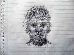 It's not meant to be a finished artwork. Let your hand move rapidly, with movement coming from the shoulder and elbow. Let your mind be free of fear of failure. If you like what you see, then later, it is possible to re-draw this into a full rendering.
1.2.36 Punching up
When you complete a drawing, all the general values have been established. The mid tones should be right and all the shadows in the right place. But sometimes you need more impact. A process called punching up can improve the drawing. This is where you look for the deep shadows and try to make them blacker. It increases drama and contrast. 1.2.37 Blending When you put graphite onto the paper, you often want a smooth transition from dark to light. In one technique which we shall look at, this is achieved without blending. The results are very nice, but the process is slow (circularism). Many people like to use a tool like a rag or tissue to move the graphite around on the paper to achieve a smooth result. Blending is to take a non-drawing instrument and use it to deliberately smudge the graphite. Depending on the paper and the grade of pencil, and the blending tool, different results are obtained. Here are some tools in common use: • Tissue. • Stump. • Paper. • Rag. • Paint brush. • Tortillon. • Chamois. JL: Hello Charles! I found your incredible paintings onThe Figure in Light after following a retweet on Twitter and instantly saw a high skill level. You are a full time painter. Could you explain how this came to be?
CP: Hello Jeremy. Thank you for your interest in my work. Here I am talking to someone on the other side of the planet whom I have never met, all thanks to the internet. I have been painting full time for about ten years. This has been possible because I have a great gallery, The David Klein Gallery in Birmingham, MI. Just as importantly my wife, Lauri Palmer, has been incredibly tolerant and supportive. JL: What is your favorite medium? CP: I work mostly in oil. JL: Why do you like working in that medium? CP: It is forgiving, it has gravitas, and I like greasy things. JL: What events outside of pursuing art have caused you most grief and joy in your life? CP: By far the most joy has been my family. We have a son who just graduated from college, and a daughter about to enter high school. The greatest grief has been the financial struggle to keep it all going. JL: Unfortunately, the cost of modern living is a major problem. It is clear to me especially for non-representational contemporary/modern art and ephemeral art that the technical aspects of a work seem to be secondary to the story of the artist behind the work as part of an unpalatable marketing machine energized by greed. I know this is a bold statement - but what are your thoughts on this? CP: I would agree in part. There certainly is a mercantile aspect to the art world that can be distasteful, but I suspect that has always been true. Regarding skill, or what you refer to as technical aspects, I think there are many non-traditional artists with loads of that, and I respect them and in many cases enjoy their work. Yet I think that modernism as a whole is disconnected from our larger culture. Very few people relate to modern art, regardless of how good it might be by its own hermetic standards. The problem though is not with the art world. In my view our culture itself is in decline, and the art world, as well as so many of our other cultural and civic institutions, has come undone. JL: I think that is a very thoughtful ans skilled answer. Please tell me more about your Pollack-Krasner Award, what it means and its origin. CP: It’s a foundation established from the estate of Jackson Pollack and Lee Krasner that gives financial support to artists. They award quite a bit of money. I got my award about ten years ago at a critical time and it really helped to keep things going. That’s one reason I can’t be too hard on modern art! JL: I do in fact enjoy Jackson Pollack's work. What events lead up to this honor? CP: I simply applied for it. I encourage anyone who is interested to do the same. It has nothing to do with who you know or anything like that. Just do an internet search and apply, but you might have to keep applying before you get an award. I applied two or three times before I got mine. I apply for lots of things, but most of them I don’t get. I still have the Guggenheim in my sights. JL: I can see that you take a great deal of care to depict light in your subjects. Could you please describe what goes through your mind as you paint in this regard? CP: I think the real medium for all visual artists is space. Light reveals form in space. Light, form, and space are fundamental to visual expression. I suppose I take this for granted and don’t think about it much when I work. I’m mostly trying to make something that looks good. JL: Is this why you called your web site "The Figure in Light"? CP: I guess so. I was just trying to think of something catchy. JL: The name works. It's easy to remember and speaks something about art in general and what you do. Looking back over your formal education, what do you consider most helpful to your current professional career as an artist? CP: The MFA program at the University of Iowa was very important. It attracted ambitious students from all over the country, and it had a lively visiting artist program. While there I was awarded a scholarship to the Skowhegan Summer School of Painting and Sculpture, and that was a critical experience for me. Being from Michigan, and having just gotten married, it was a big decision to move to Iowa, but I am really glad I did. I also want to mention Robert Wilbert, a painting professor at Wayne State University in Detroit. I took a couple of classes from him before going to grad school in Iowa. He was incredibly influential. He taught me to see space. JL: Are there things which simply cannot be taught? If so, how do you acquire those skills? CP: This is a really important question but I’m afraid I just don’t know. Sorry. JL: That answer is oddly satisfactory, and I am sure there are people who hold an opinion, but who is to say they could possibly be correct? As a teacher, what advice can you offer for young or beginning artists? CP: You have to be obsessive about working. You must get into the habit of drawing daily, and always keep a sketchbook, like a diary. Draw anything and everything – the view out the window, your friends, yourself, your toes, what you dream and daydream about – but mostly draw from life. Avoid working from photographs for at least ten years. JL: Charles, It's been a pleasure. Thank you very much for your valuable time and insight. CP: It’s been a pleasure for me as well Jeremy. Thank you. 0 0 0 0 0 0 0 If you have more questions. I am quite sure Charles would be able to respond. It's cool and wet and windy in Sydney town today The bins are crammed with brollies in temper thrown away. Broken, busted useless ravaged by that wind. An image on display of sapien temperamind. I saw a documentary about gorillas under trees who when it rained just soaked it up not shooing it away. What's happened to this human race? Impossible to say of why or how or who or what would wish the rain away.
1.2.34 Pop
When you draw something that should be sticking out of the page, like a nose, if it looks like the paper is no longer flat, and the nose could really be sticking out of the paper, then it has POP. This is achieved by careful rendering of light and shadow. 1.2.35 3D A piece of paper only has horizontal and vertical coordinates. It therefore only has two dimensions, but we can use shading, highlights, focus and blur to create the illusion of a third dimension perpendicular to the page. This really is an illusion. The paper is flat, but the mind is accustomed to seeing certain shadows and highlights in certain arrangements on a real three dimensional surface. When we successfully emulate this in a drawing, the effect is to trick the mind into appreciating this third dimension. Part of this is simply because the sun is above, and shadows are underneath objects. |
(C) Jeremy Lee 2010, all rights reserved.
Note: I am allowing the blogs in the category 'Book' to be stored for personal use only, but not for distribution or commercial use. Should you wish to reproduce any material, please contact me for negotiations. Categories
All
 spOOkspOOk's art is owned by Jeremy. He has practiced drawing and painting for about 40 years, and might get good at it one day. spOOk's art is focused on graphite portraits. Archives
October 2016
|
