|
1.2.31 Angle
Lines which are drawn or implied which are not either horizontal or vertical create a dramatic effect. Diagonal and angled lines help to accentuate a subject or lead the eye to a specific place in the drawing. Sometimes, the diagonal lines are made from parts of the subject. Sometimes the lines will be part of the background. As with any tool, don't over use the idea. Ideas that are over used become boring. 1.2.32 Composition You will be able to obtain a whole book dedicated to the topic of composition, so I'll mention that it is very important, and advise that you find some extra literature on the subject. The purpose now is to define the term. Composition obviously comes from the verb to compose which means to put parts together into a new whole. In a picture, the parts that are available include at least the following:
A good composition will hold the viewer's attention, and let the eye explore the drawing and rest on the desired subject matter. All the elements should compliment and enhance the subject, and there should not be two or more equally competing objects in the drawing... unless of course you want and can control this effect. It is also a good idea to arrange the objects so the viewer's eye is held within the frame. A drawing which contains an arrangement that causes the eye to leave the frame is unlikely to hold interest. Some, or perhaps most people can feel a good composition when they see it even without being able to explain the theory behind it. If you can do this, then take advantage of it by playing with the elements until they feel right. This is a good reason to draw several sketches.
0 Comments
1.2.30 Feeling
It might seem strange to talk about feeling in connection with drawing, but one of the goals of art is to induce some kind of emotion in the viewer. You can use expression on a person's face to convey a feeling. This might be sadness, shock, tiredness and so on. Also, the background, texture, composition and the way that objects are presented will have an influence on the feeling of a picture. Colour invokes emotion but in our graphite portraits, we have only shades of grey. Although this might seem a disadvantage, it can be very dramatic and deep. It is interesting that black and white photography used to be the cheap and easy method, while colour photography was considered expensive and elite. But today, we find that the processes for colour photography has become mass produced, cheap and common. Black and white photography is now considered dramatic, arty and elite. At the time of writing (2008), graphite art is slowly making progress in the art world. Hopefully, this is because great graphite works are so capable of showing feeling. The absence of colour should be treated as an advantage to bring out the drama of a subject. We continue with the word-definitions for graphite drawing. There are a lot of terms. Once this is complete, we will see some techniques and examples.
First, let's look at graphite shine a little more... 1.2.28 Shine Since the graphite flakes are flat and shiny, if you rub a pencil hard on the paper, it will flatten the tooth and lay all the flakes flat on top of each other. Light will reflect off this smooth surface and cause shine. This is undesirable because a shiny surface will not properly represent a shadow. It is wise to lay down the graphite and preserve the tooth so that each individual flake of graphite reflects light in a different direction. Carbon and charcoal pencils are made of rough bits of black carbon grains, and do not reflect light so easily. For this reason, carbon and charcoal are very useful for deep dark areas. Some types of paper cause shine more than others. You will need to experiment to find out what suits your style. The effects of shine are reduced a little when the work is mounted under glass, and if you use a spray fixative it tends to remove some shine. 1.2.29 Grade Pencils are marked with a grading system. There are two measures: B and H. Each letter could be preceded by a number which indicates a weighting for the letter. B represents the amount of graphite and H represents the amount of clay. Graphite is soft and shiny, while the clay is hard an matte. On a scale from soft to hard, we get: 1. 8B 2. 6B 3. 4B 4. 2B 5. B 6. HB 7. H 8. 2H 9. 4H 10. 6H On any given paper, each of these will give a very dark (8B) to very light (6H) value. For any given pencil grade, it will give a different value depending on the paper used. Some papers takes darks better then others. HB is sort of the middle and is a general purpose pencil that we use in schools. Softer pencil marks, when used lightly are easy to erase while harder pencil marks can damage the tooth of the paper and leave an impression. Therefore, very light pressure in many layers will often produce superior results when compared to heavy-handed marks. 1.2.26 Balance
Related to weight, is balance. The left-right composition of a work should usually have similar weight. If you ignore this, then the composition might feel somehow uncomfortable. Bear in mind that there are several ways to create weight, and the two sides of the drawing don't need to use the same technique for good balance. You could use contrast on one side, and focus on the other. It should be an intuitive thing: try it, see if it has a good feeling, adjust, experiment, and finally settle on something. As with any rule in art, bend it and break it if it makes a statement that you need to convey. You might deliberately cause imbalance for a dramatic effect, to control the composition or for some other reason. 1.2.25 Scumble
For oil and acrylic painting, scumbling is a technique to drag a lighter colour over a darker one, where the lighter colour is more opaque. A realistic shadow should be thin, insubstantial, free of significant reflections and bear nothing in particular for your eye to rest upon. The mid tones and highlights are opposite to this. Highlights should be opaque and solid. Scumbling is used to link the two areas of paint. Obviously, scumbling has a more limited meaning for a graphite drawing but we can exploit the same idea in the following way: Shadows in your drawing will saturate the paper so that little or no tooth shows, and the tone will be flat an uninteresting - just as a shadow should be. The highlights will probably consist of harder graphite, more defined pencil marks, and texture both deliberately drawn and inherited from the paper's tooth. For a graphite drawing, you can use a scumbling technique to join these two areas. Try honing a wooden pencil to a cone-shape and use the flat of the cone to bring the darks into the lights. To do this, hold the pencil at a shallow angle so it has maximum area contact, and gently drag it from dark to light. You can then adjust this effect by using various grades of pencil with a smooth wedge shape to introduce the shadowed area into the highlight. It is important to gradually increase the tone and detail as the transition completes from dark to light. 1.2.23 Sketch
A sketch is a quick drawing. Sketches are useful tools to explore shape, value, contrast, texture and composition. It will be useful to create many rapid sketches of parts and the whole before finally committing to a full rendering. You might sketch someone's ear twenty times from different angles just to get a good feel for the final picture. When you do this, it makes the final rendering easy. 1.2.24 Weight There are two kinds of weight relevant to our drawing. One is a measure of how heavy is the paper. This is measured in gsm. Heavier papers will cost more, but they are likely to cope with rough handling. Light paper will crease easily, and it will not be easy to use an eraser without damaging it. The weight of paper is measured by the physical weight of 500 full-size sheets. It is given in grams or pounds. A typical useful weight for drawing is 220 gsm. (grams) The other kind of weight is about composition. If you think of a cone standing on its point, then this cone, even though it is just a piece of paper, it is compositionally weighted at the top. When you frame a picture, it is is conventional to put a mat around the picture, and that mat sits in the frame. The border of this frame is often made wider at the bottom to add visual weight. This helps the picture to sit on something solid or visually heavier at the bottom. We expect objects to look heavier at the bottom. Within the picture, we might add more detail in the foreground, and greater contrast, and an overall darker tone to the lower 1/10th to add weight. Sometimes it is desirable to break this rule. In the picture below - you will probably be fooled. It is designed to make you see comical faces looking at some kind of floating blob and weird tongue-like things but the real image is hidden in the negative space. See if you can find it. Click on the image for a large view. 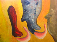 1.2.21 Negative space. Beginners often draw the shapes and objects which are the subject. This might be an apple, pear, banana and a bowl. If, however, you consider the arrangement of items, and instead, study and draw the shapes which make up the space between the objects, then you get a different understanding of what you are seeing. These negative spaces are part of the composition. Sometimes, a negative space is more important than the objects, and it will often contribute to the overall result of your drawing in an unconscious but significant way. When you draw negative space, you use the more 'arty' sections of your brain because these shapes are usually abstract. Since they are abstract, you can draw what you see, and not what your logical part of your brain tells you to see. If you are using a reference in the form of a photograph or a live set-up then it's very common to draw what you know and not what you see. Initially, this often leads to an average or poor result. The problem is how our brain works. We seem to symbolise many shapes, so that an eye has a standard simplified shape, and a mouth has a simplified shape. It is as though our brains store a set of approximations which we use for some kind of pattern-matching machine when observing the world. Perhaps for this reason, the non-artist looks at a person's face and spends sub-seconds on each feature while the seasoned artist will tend to focus on a particular area and study it deeply. As you do more drawing, you will find that your interest lies not so much in the shape of a mouth or nose, but in the way that the shadows fall over the contours of the face, and how the light picks out imperfections in the skin. Study of negative space aids this artistic way of viewing the world. In some complex scenes, where the foreground consists of many tiny shapes - like tree branches or hair, then it is often easier to identify and draw the negative space before filling in detail in the foreground. 1.2.20 Light Obviously, without light, you can't see. It is only the reflection of light which reaches your eyes that causes your mind to see the object. But from an artistic sense, there is more to it than this simplistic statement of physics. When a painting has light, it glows and lives. 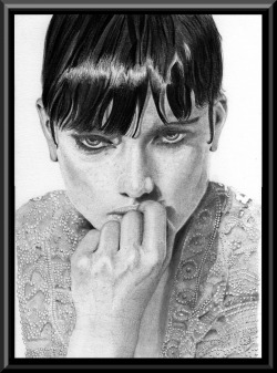 There must be millions of good drawings and paintings which don't make the best use of light, and therefore remain only good pieces of art rather than great pieces of art. In the illustration, each tiny bead on the blouse reflects light. There is a prominent shadow under the chin, and a strong highlight in the hair. Her knuckles reflect more light where they protrude.
Often, in western society and those that read left to right, the observer will tend to also 'read' a painting or drawing from left to right. For this reason, it is common to find the light coming from the top-left as it is in this illustration. However, such 'rules' should be flexible, and some dramatic effects can be had by using two or more sources of light, and lighting the subject from below or directly from one side. Whatever you choose to do, try to make the light work for you. 1.2.19 4D Your paper is two dimensional. It might seem a little silly to try to make a four dimensional representation on a two dimensional surface. But let's think about this. We are quite happy to depict a 3D object on the 2D surface of the paper - so there should be no fundamental reason why we cannot depict a 4D scene on paper. The fourth dimension I am thinking of is that of time. When we take a photograph, it freezes a tiny slice of time and compresses it onto a two dimensional surface. This can give stunning and dramatic effects but it has limitations. An object in motion will move during this tiny time-slice, and this will cause motion blur. A good photographer can take advantage of this by either panning the object to displace the motion blur onto the background, or keep the background fixed and let the moving subject blur. 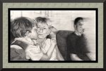 In this scene, we can see time. The young boy kisses his Mum tenderly, she responds, but his bigger brother anticipated this and reeled back in mock disgust. You can see the sequence, even though the picture is laid out in only two dimensions. The relative motion blur aids this as the older boy has moved into the light in the background which obscures part of his face. The results of camera blur are difficult to control. However, when it is successful, the result will give you a sense of time because of the motion blur. But motion blur is not the only way to represent time on a 2D surface. As an artist, you have no technical limitations of the camera. You can choose to draw or paint things in ways that which are not possible to photograph. You can depict hidden surfaces which might suggest what is about to be revealed to a person viewing the scene. You can depict movement and anticipation. Incidentally, movement can also be an important part of an abstract piece. It's harder to describe than movement in a realistic object, but nevertheless, movement can certainly be suggested with non-realistic shape and form. You can depict history though careful composition. For example, objects which have just hit the floor will appear broken, and the expression on a person's face could combine with this to suggest what has just happened. It is very difficult to describe this 4D effect, but to know that it is 'out there' is a great advantage. The next time you go to an art viewing, ask yourself, “Why does this painting seem static, and why does that painting seem alive?” The chances are that the more lively painting has somehow integrated the fourth dimension. It could be an expression on a person's face, or the arrangement of objects in the air. It might be through the play of light and focus.
Art is not only about shape and form or value and hue. It is a method of communicating. Sometimes mysterious, sometimes shocking, and often controversial. 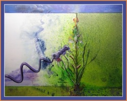 Life The abstract here is full of symbolism. In it you will find Fibonacci, the golden ratio, metaphors for chaos, and the primordial cosmic soup. There are elements that depict spawing and growth, space and soil, tempest, void and... well perhaps you can find some more. How does it make you feel?
|
(C) Jeremy Lee 2010, all rights reserved.
Note: I am allowing the blogs in the category 'Book' to be stored for personal use only, but not for distribution or commercial use. Should you wish to reproduce any material, please contact me for negotiations. Categories
All
 spOOkspOOk's art is owned by Jeremy. He has practiced drawing and painting for about 40 years, and might get good at it one day. spOOk's art is focused on graphite portraits. Archives
October 2016
|
